Product Photography
In this post, I’d like to talk about how I approach product photography.
First things first: research is key. You always have to do your due diligence when it comes to product photography. Why? Because trends are a huge influence in any commercial industry. So, if you don’t research what are the current trends, you’re more likely to miss the target on where you intend to market your photos. In the case of product photography, the trend is to have the product well and evenly lit. Now, to be fair, editorial product photography has a lot more leeway when it comes to creative lighting and set ups. In this blog, we are not going to cover this topic. Instead we are going to stick with the basics of straight product photography. These types of photos are used for catalog purposes and are found in physical product catalogs, promotional material, online marketplaces and brand sites. Now, you’re probably thinking, “okay, what’s so hard about well and evenly lit photos?” Well, this is not the trend, rather it is a standard. The trend is the use of a specific flag when taking these photos. Let me digress a moment for those new to photography, film or video. What is a flag? Well, obviously we’re not talking about a piece of cloth that is attached to a pole, though some flags have this appearance, hence the namesake. Technically speaking, a flag is a light modifier or a lighting control. It is simply an object or a device that is used to block or modify your light source. Examples of lighting modifiers can include such devices as, barndoors, bounce boards, butterflies, cucoloris/gobo, dots, egg crates/honeycomb grid, reflectors, scrims, soft boxes, etc. There are several different types of flags, which I’m not going to get into, since they all pretty much do the same thing. In this post we will be discussing a specific type of flag for a specific type of product photography.
Secondly, you will need an infinity (i.e., no horizon lines) backdrop/background. This is a backdrop that is similar to a cyclorama (aka: cyc [pronounced, “psych”]) wall where there is a curved transition where the wall meets the floor, which eliminates the perception of depth or an end point. You’ve probably seen this used with paper, muslin or vinyl backdrops. Depending on what style you are attempting, your background will usually vary between white, black or grey. Black and white are the most commonly used backdrops. You can purchase (or rent) a tent, table, mini cyclorama or studio, or you can make your own. I do a little of both, depending on the level of difficulty of the do-it-yourself (DIY) project. Backdrops are some of the easiest DIY projects, because they can be relatively inexpensive to make; construction, craft or Bristol paper (or foam-core board or certain types of cloth) comes to mind.
Finally, we’ve come to the flag. This can also be an easy DIY project, using the same materials mentioned in the backdrop section. Besides, material, size and shape of the flag, one of the most important factors of a flag is reflectivity (or rather, anti-reflectivity). All black mediums are not the same. One brand of black construction paper may not have the same reflectivity as another. This is where your light meter comes in handy.
Safety tip: Remember that if you are working with “hot lights” (continuous or high-intensity lighting such as, incandescent, HMI, halogen, etc.), you will need to verify that the flag medium that you are working with has a heat rating or has enough distance from the heat source to keep from combusting. It is important to note that most paper products have an autoignition point of around 425º Fahrenheit. Personally, I use approximation standards when dealing with electricity and hot lights. Just as with employing the “paper amp” (a rounding method used to stay within a fuse’s amperage rating) for power consumption (wattage) when dealing with fuse boxes, with hot lights, I use a less than 400ºF rule. I will test a paper product that I intend to use as a flag well before I employ it. In cases where I don’t have a choice, I’ll use Cinefoil (this is an expensive option, about $20-$30 for a 12-inch by 50-foot roll). Cinefoil is made from black anodized aluminum foil which is far thicker than the standard kitchen aluminum foil. It can handle relatively high temperatures and can be shaped to the user’s needs. It is a staple in filmmaking circles. However, because of its price, many people (including me) will reuse it until it is no longer viable.
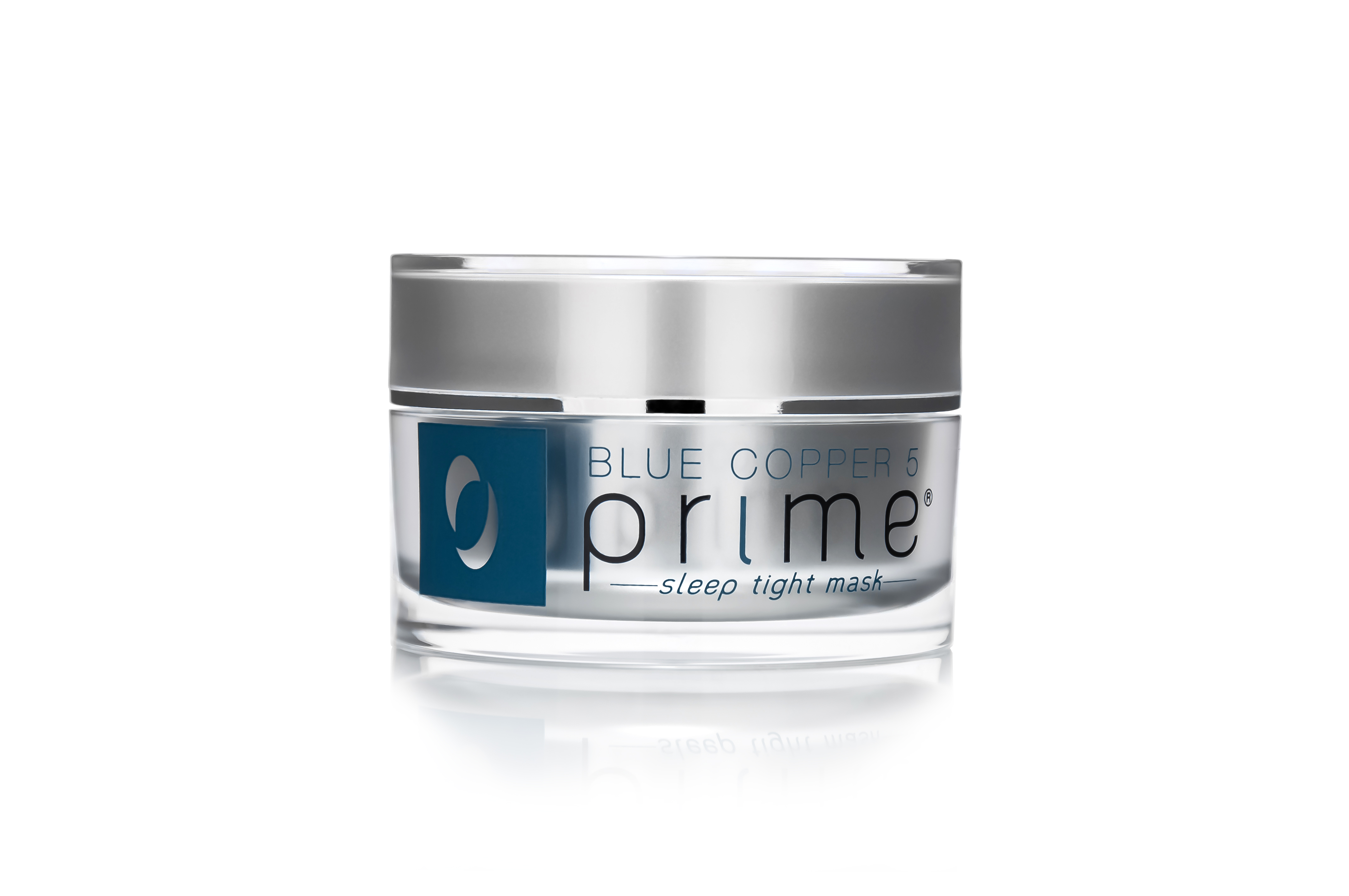
The flag that is commonly used for many types of cosmetics, skincare and perfume product photography is the “Zebra ‘M’ flag.” Why is it called, a “Zebra ‘M’ Flag?” Quite simply, because it produces a black and white stripe effect on the product. The images below are examples of the results that a “Zebra ‘M’ Flag” produces. What is the “M” for? Well, it is basically a shoot-through flag that slightly resembles the letter, M. The latest product photography work that I have done and continue to do is for Osmotics, LLC, a luxury anti-aging skincare brand (i.e., a cosmeceuticals brand). So, the following images are from the Prime line of Osmotics cosmeceuticals.

Product photography using the ‘M’ flag

Product photography using the ‘M’ flag
Product photography using the ‘M’ flag
As you can see, these products are different sizes that vary on the reflectivity scale. There were a few challenges to overcome when it came to shooting this set of products. First, was creating the appropriate sized “Zebra ‘M’ Flag.” This was a trial and error process (along with lighting the scene and adjusting the camera’s aperture and shutter angle). Second, the studio that was available to me was very small (about 100 sq. ft. or 10’x10′), but was okay for a product shoot. I say, “okay,” because the room was also used as an overflow storage area, so the working area was actually much smaller than the given dimensions. Third, because of the small working space, I could only stage and adjust products from the front. In a larger space, you would normally want working space on all sides of your table, thus allowing for more efficiency when making adjustments. Furthermore, the lack of space makes lighting a little more challenging, because at close distances it is important to have lights/strobes with dimming controls. Otherwise, you’ll be relying completely on gels, scrims or other light modifiers, which will make setup times longer.
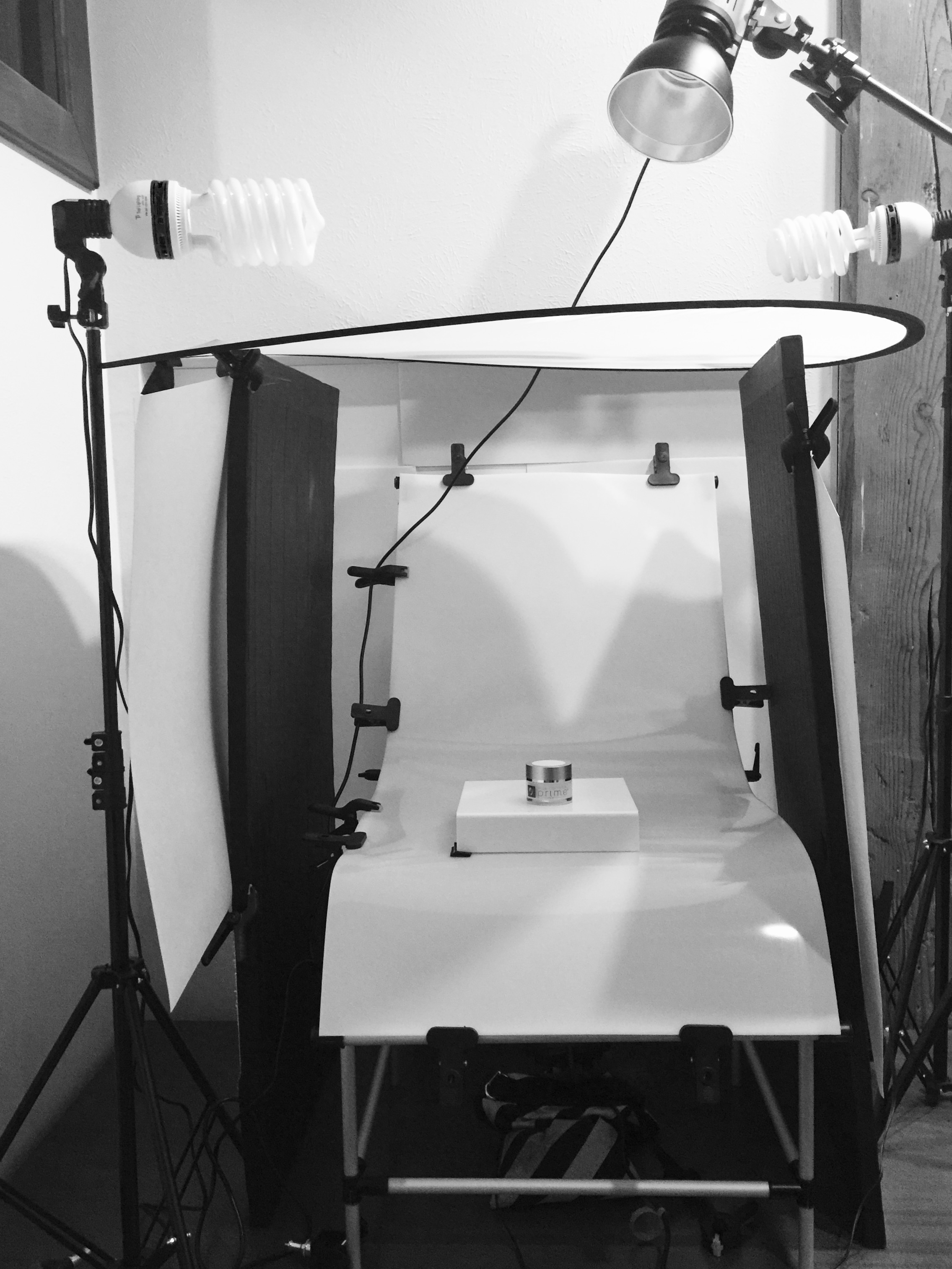
Product Photography Table Setup

Zebra M Flag
Closeup of black strip
The table’s surface is a reflective, white, translucent plastic. I employed five different lights in this setup. First, the ambient light is created using two large 5600ºK CFL lamps. This is used to fill any hard shadows that may be in the shot, but their main purpose is for focusing. The key light is a 300W/s strobe at the top of the image. Though slightly off-center in this picture, it was centered for the shoot. A second strobe (not shown) is below and to the rear of the table. This acts as the background light. It is aimed toward the ceiling (like an uplight), as well as bounced off of white foam core boards placed behind the table that help bounce light through the translucent plastic. This is meant to blow out (overexpose) the background into an even white, which will help when it comes time to separate the image from the background in Photoshop. Avoid aiming your light directly at the back of the product, as it will cause softening of the edges as well as a host of other backlight issues such as, flaring. To reiterate, this post is for a specific style of product photography. Flaring, backlighting and other creative techniques are perfectly fine in this category when shooting for editorial or marketing purposes.
How is the key light used in this setup? Well, it is used in conjunction with the “Zebra ‘M’ Flag.” A “Zebra ‘M’ Flag” is used like a reflector to create the dual light bars and the black center strip. The key is bounced off of the flag and back onto the object. Some flags are made with varying stripe styles. It doesn’t necessarily need to be limited to two white bars and a center black strip, this is just the trend. Also, the key doesn’t have to be placed in the same way as it is in this example. This setup is by necessity, because of the lack of room. I would have preferred to place two keys (at half the power) in a butterfly setup at the sides of the shot and angled into the flag.
I used a bead board (a type of reflector) that I made from insulation foam (that can be purchased at any Lowe’s or Home Depot) and black gaffer tape. Since a lot of insulation foam has only one clean side (the other side is printed with brand info), I covered the printed side with black gaffer tape to create a double-duty bead board. I use this a lot, because it’s great as a large flag or reflector and is light enough to use with C-stands. It also lasts a very long time, even with a modicum of abuse. I’ve had these two bead boards for almost 5 years.
In this setup, as you can see, the bead boards are used as a type of flag, but actually they’re just being used as black walls. This helps to create the wrap around gradient effect that you see on the sides of the product. The white card stock that you see clamped to front-facing sides of the bead boards are there to keep out light, dark or color spill that will show up on the product. In this case, it was to create a harder, wider line for the white stripes. I’ve also used black card stock in similar setups.
The overhead silk is used to soften any specular spill onto the product. The product stand on the table is made of reflective white plastic. This was used to create the product reflection (I prefer to do as much in-camera as possible). This is just a personal preference that you can choose to do or not, because I know quite a few people that would create the reflection in post.
Now, I work predominantly as just the photographer when it comes to product photography for Osmotics, LLC. The majority of the post work is done by me, but our Art Director may want to add minute details or elements or completely overhaul the image, so the only real Lightroom and Photoshop work that I do, is touchups, color correction, color-grading (if needed) and layer masking (separating the product from its original environment). I submit the photos in JPG, TIFF and PSD formats. Marketing needs are fluid, so the PSD files are never flattened or merged nor is the background layer ever touched. I keep all the layers separated and leave masking paths open. This is how the Art Director prefers it, so I adhere to those standards.
As for camera settings, I’m not going to get into it, because it will vary from camera-to-camera and setup-to-setup, as well as the shooting environment. All I will say, is that you to achieve sharp edge lines on your product, you will need to have your aperture closed down considerably. These photos and other similar ones were shot at an aperture at or between f/16 and f/22.
Okay, I’m going to assume that you want to know how I made the “Zebra ‘M’ Flag.” Well, it’s actually a very simple process that even a child could accomplish. It’s basic arts & crafts.
Supplies:
- (1) Black foam-core board (20″x28″)
- (2) White card stock paper (22″x28″) or Mylar card stock paper
- A strip of black cloth or construction paper
- Large cutting mat
- Large T-square or ruler
- Utility knife
- Adhesive
Construction:
- Measure and mark the layout pattern
- Cut all paper pieces to desired size
- Cut out the center shoot-through gap on the foam core
- Glue the white card stock (or Mylar) to the foam core
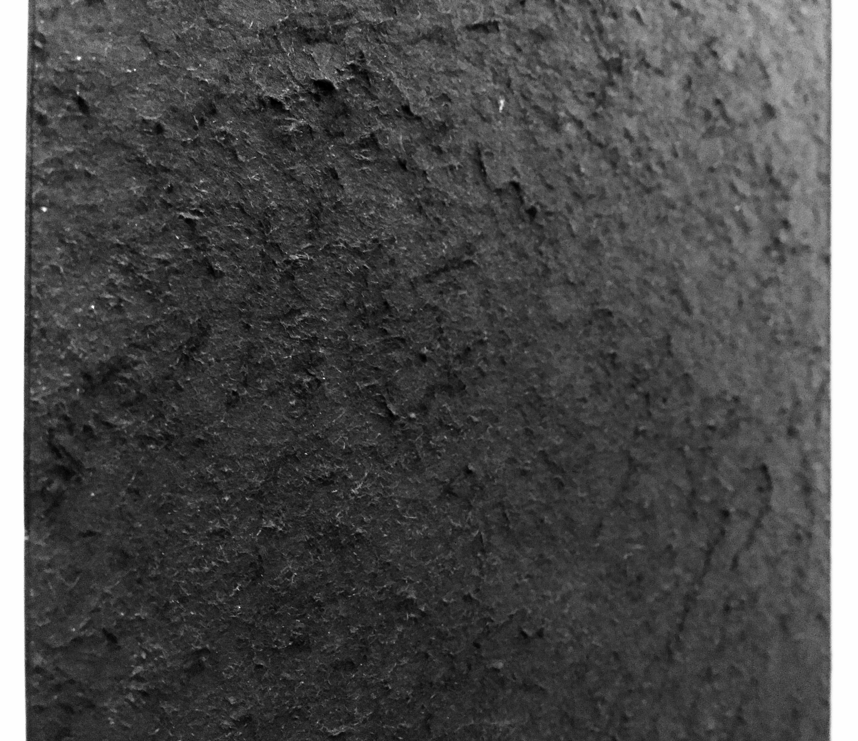
Note: the second and third steps are interchangeable. The center cut is much longer than it appears in the example, because there is a strip of black cloth clipped to the flag. The purpose of the cloth is to cover the center cut-out around the lens. You can use black construction paper if you don’t have cloth available. This will keep the black strip consistent in the photograph as well as keep out extraneous light.
Finally, to allow for more absorption of light and less reflectivity (since foam core has a smooth surface) from the black strip, I scored the surface of the center strip and peeled the top layer of paper to create a rough surface. By creating a rough surface, much of the light will be absorbed, and that which is reflected, will be sent off in various directions.
Okay, here’s a behind-the-scenes process that we do here that may not be common practice for all product photographers. When I shoot each product, I also shoot a blank version of the jar. This is so the Art Director can composite in text, logos or anything that may come up that requires a blank. On the Prime Eye jar, because the internal cup (which holds the actual product) is so much shorter than the height of the jar, the print on the back of the jar can be seen in the image (not just through the back, but it also created a reflection on the bottom of the jar). Instead of doing incredibly painstaking work in Photoshop, I chose to remove the print with a solvent and a plastic razor blade (you can find it at Ace Hardware in the paint department near the paint scrapers and putty knives, these are made for removing things like bumper/window stickers). This is also a painstaking process, because of how careful I had to be to not remove or mar the jar’s surface or the front print. I practiced on a couple product tester jars first before I attempted it on the ‘work’ jar.
Thank you for reading.
